Designing a font pairing web tool to support faster, more confident typographic decision-making.
(Interactive prototype)
Intro
Web-based font pairing generator built on the Google Fonts API. It differentiates itself from similar tools by using measurable typographic variables to pair fonts, and includes an educational guide that explains the logic behind each combination.
Role: Self-initiated. Concept and research, UX, UI, AI-assisted front-end development, manual refinement
Tools: Figma, Claude, Google Fonts API
Problem
Most font pairing advice online falls into one of two groups: vague rules ("mix a serif with a sans-serif") or suggest using subjective tags such as "old style", "handwritten", or "high-tech" that describe feeling but teach you nothing about the fundamental structure of a typeface. I kept running into this when working on projects. I'd find a font I liked, spend an hour looking for something that paired well with it, and still feel like I was guessing.
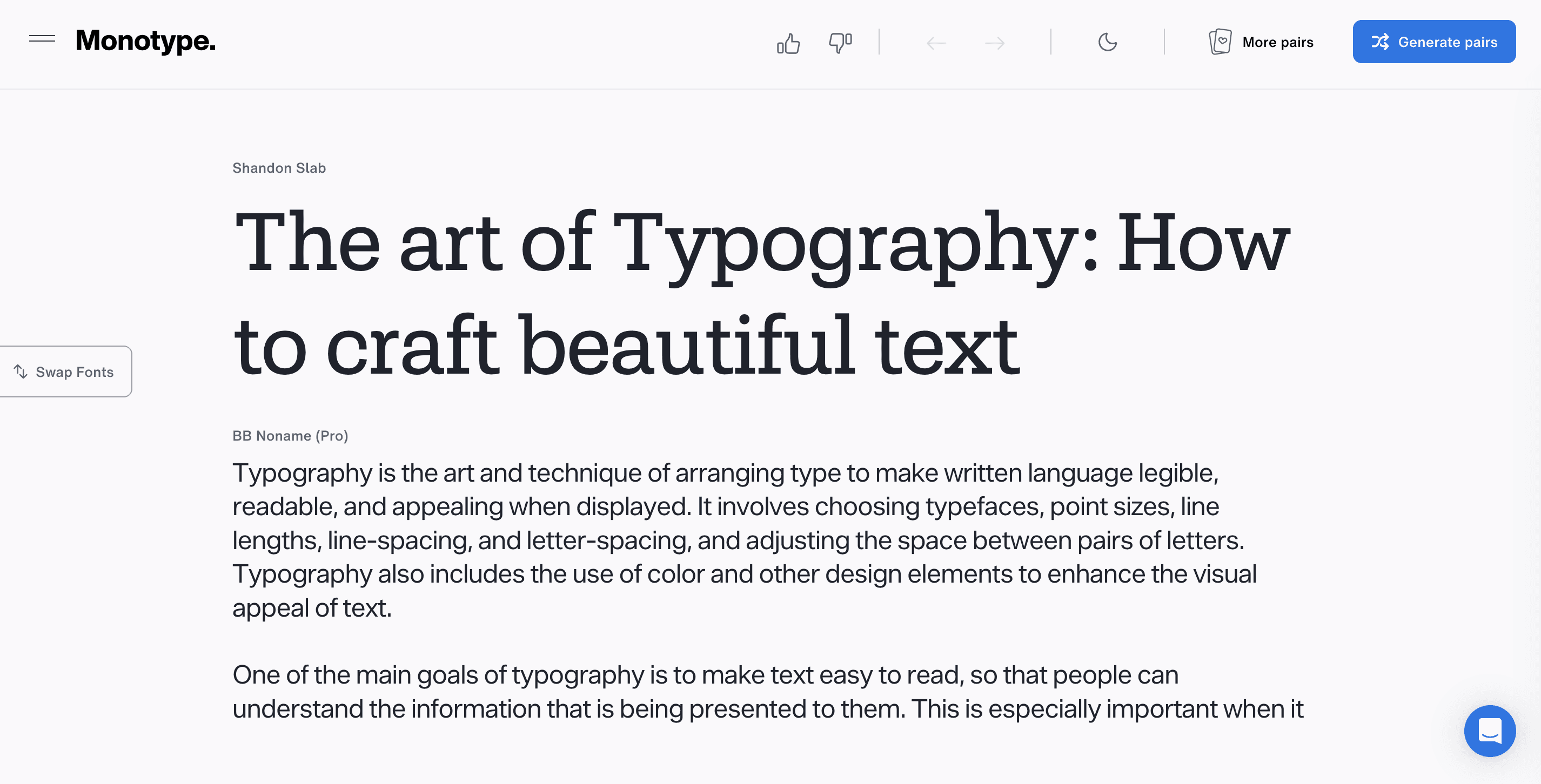
Monotype's Font Pairing Generator
Research
I figured I couldn't be the only designer struggling with that, so I focused on learning more about typography to find out what the reason really was. And the more I read about it, the more it became clear that the problem wasn't taste, it was that I lacked a proper framework for reading typefaces structurally. That's when I found out about the Font Matrix, a system developed by typographer Indra Kupferschmid and featured in a Pimp my Type article by Oliver Schöndorfer. The system describes typefaces across three objective variables: form model (dynamic, rational, or geometric), stroke contrast (contrasting or linear), and terminals (serif or sans).
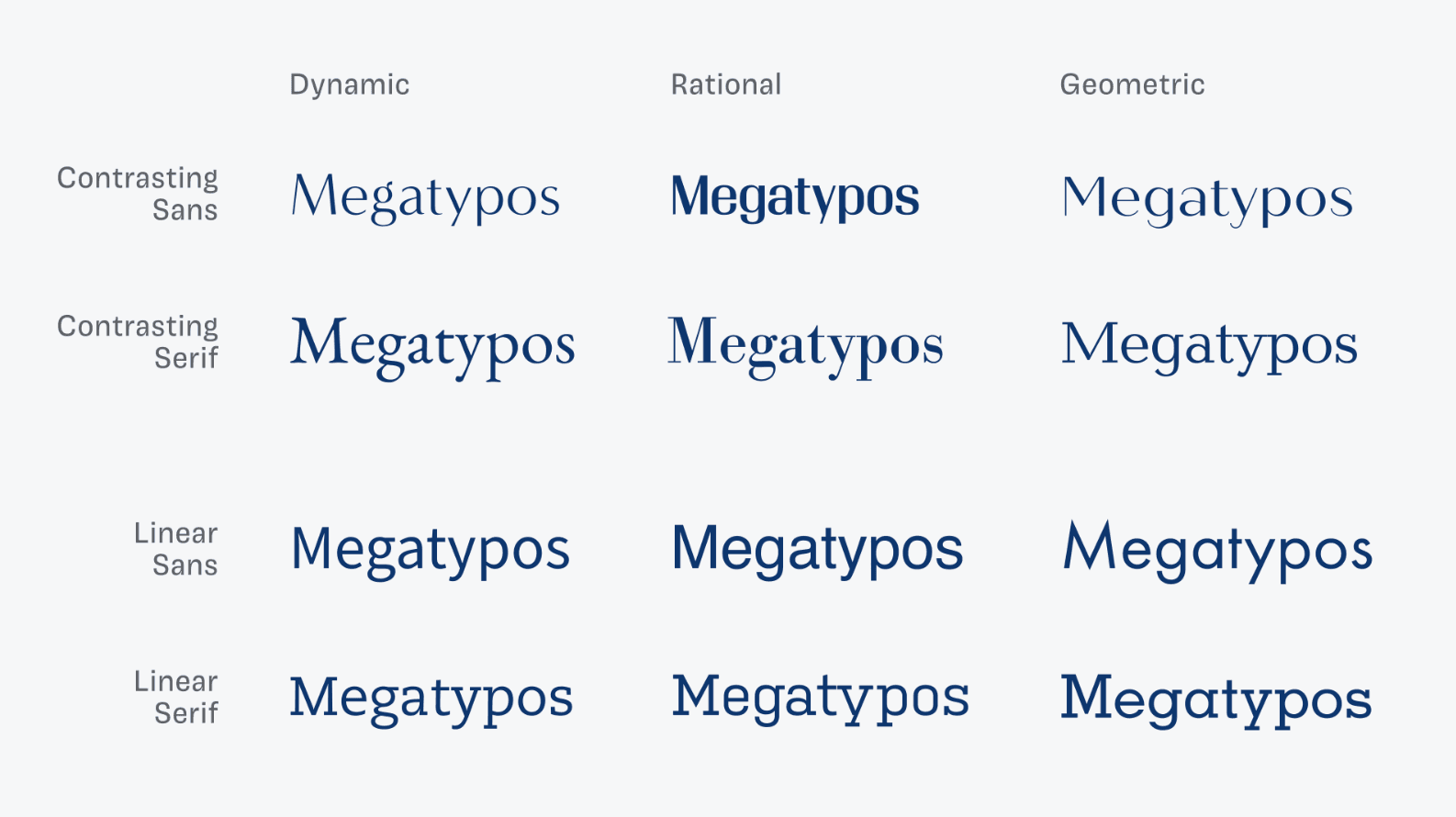
This visual is extracted from the same article by Oliver Schöndorfer
The article already offers a detailed explanation of how the system works. To summarize, pairings that share a form model or contrast sharply across all three axes tend to work. Pairings that look superficially similar but differ at the structural level tend not to (as shown in the above table). I decided to build a tool around this system, one that made the logic visible rather than hiding it behind a "generate" button.
Approach
I started by classifying a database of Google Fonts starting with the form model variables, which meant evaluating fonts by aperture openness, axis tilt, stroke transition, and terminal style. Some fonts, like Roboto, were ambiguous, so I had to use my best judgement and document it. The pairing algorithm avoids what Kupferschmid calls a "bad match": fonts that look similar but are structurally incompatible. Every generated pair either shares a form model or contrasts across multiple axes.
I then wrote a prompt in Claude LLM to generate an early version of the app. It worked but the UX needed a few adjustments. For example, Claude's prototype showed variables as separate tags below each font, which was hard to read. Moving them into a comparison table made the relationships clear at a glance. The final guide includes a pairing type and score, a contrast matrix, a summary sentence describing the relationship, typographic specimen cards, a short explanation of why it works, and suggested headline and body use.
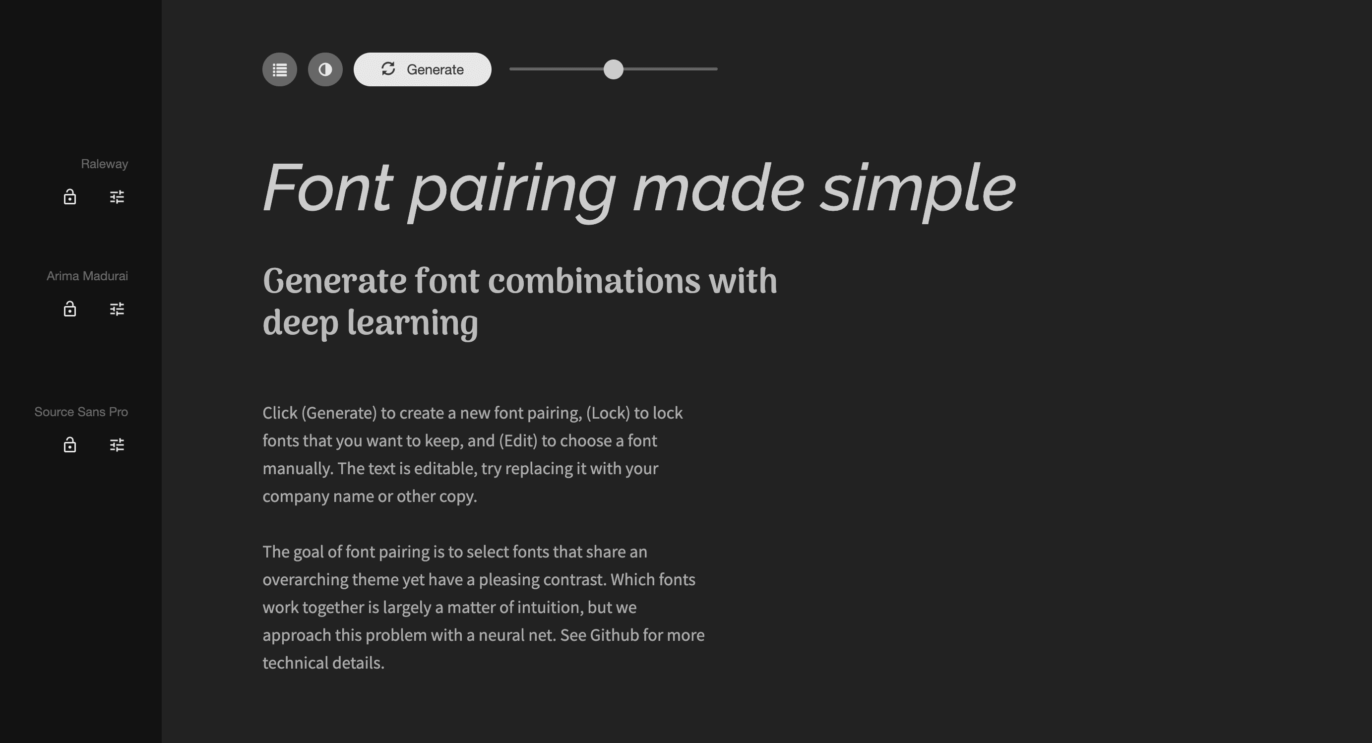
Refining the UI was the hardest part. Because the tool’s interface is primarily typography, legibility is crucial (if the interface competes with the fonts, the tool fails). I iterated on spacing, hierarchy, and how much information is displayed at once. The dark-first theme was an intentional choice, keeping focus on the typography and allowing accent colors to stand out without feeling noisy.

Outcome
The tool generates font pairings across a database of 55 Google Fonts, classified and scored against the Font Matrix system. Users can lock either font and shuffle the other, swap the pair, resize previews, and edit the sample text directly. The guide updates with every new pair, explaining the structural relationship in simple terms. The feature I'm most satisfied with is the contrast matrix, because it standardizes and visually translates what is otherwise a purely cognitive activity for designers (when we think things like: "These two fonts feel right together", "These don't", "I like this pairing but it looks a little off").
Testing
I didn't run a live test on this tool. Instead, I decided to perform a usability simulation based on three areas: task modeling of common typography workflows, a simple review of interaction effort using usability heuristics, and simulated user behavior across three typical profiles: a design student, a design professional, and a general user with no design background.
The goal was to estimate usability impact compared to a standard manual font-pairing workflow (example: browsing Google Fonts to manually pair options). The tasks being evaluated were:
Generate a usable font pairing for headline + body text
Adjust typographic scale and evaluate readability
Interpret pairing quality using system feedback (matrix + explanation layer)
Findings
The first aspect I was able to confirm is that the tool significantly reduces the number of decisions required in the font selection process. Here's a basic workflow pattern for it: generate → validate → adjust.
While here's a common workflow pattern people follow when manually matching fonts: search → scroll → compare → open multiple tabs → test pairing → repeat.
Shifting from an explorative model to a constrained/generative lowers the amount of decision steps required to choose a pairing, reduces cognitive load related to switching between alternatives, and speeds up the process of finding a final usable pairing. While these observations are shared across other font pairing tool that have already been doing this, the addition of the contrast matrix (form, stroke, ends) acts as a structured explanation layer, externalizing typographic reasoning. This reduces reliance on prior typographic knowledge supporting the principles of recognition instead of recall and the use of visual thinking instead of abstract comparison.
This structure benefits student and non-design user categories as it validates typographic attributes by translating those into text and visual cues. This is especially true for the "Why it works" section. The hope is that user can learn to discern typographic relationships between fonts over time by understanding the matrix logic, with a final trade-off: exploratory freedom being heavily constrained especially in the case of more experienced designers and those who seek a more experimental or expressive/break-the-rules kind of approach.
Conclusion
Working on this project reinforced something I keep coming back to as a designer: the most useful tools are the ones that make their own logic transparent. The tool demonstrates strong usability advantages in simulated conditions, particularly in reducing decision complexity, making typographic decisions more explicit and helping reach workable designs faster. However, it intentionally trades off exploratory freedom for efficiency, positioning it as a constraint-driven design assistant rather than a discovery tool. But, again, when the goal is not just to pair fonts but to give someone enough understanding that eventually they won’t need the tool at all, the tool itself becomes a means of creating a foundation for later independent typographic exploration.
About & Contact