Redesigning Nowa, an anti-waste food app, with the goal of minimizing attrition, helping users save food automatically and consistently.
Intro
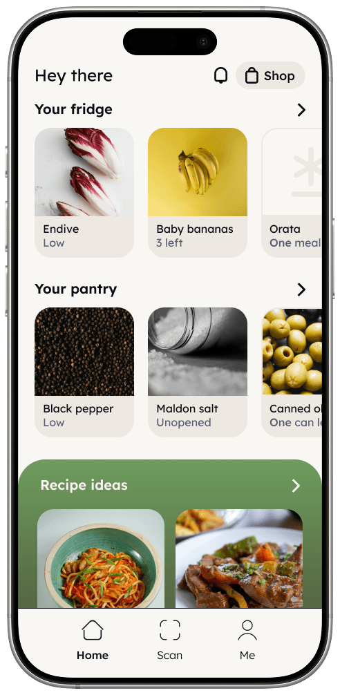
Nowa started as an academic group project: a system to reduce household food waste using a mobile app paired with a physical tote bag embedded with RFID technology to scan products. I recently revisited the project and decided to update it. My redesign focused on the app’s user flow, information architecture, and interface, incorporating current AI developments to create a smoother experience. The goal was to simplify the system, reduce user attrition, and make the process more intuitive.
Role: information architecture, interaction design, visual design, hi-fi prototype
Tools: Figma, Miro
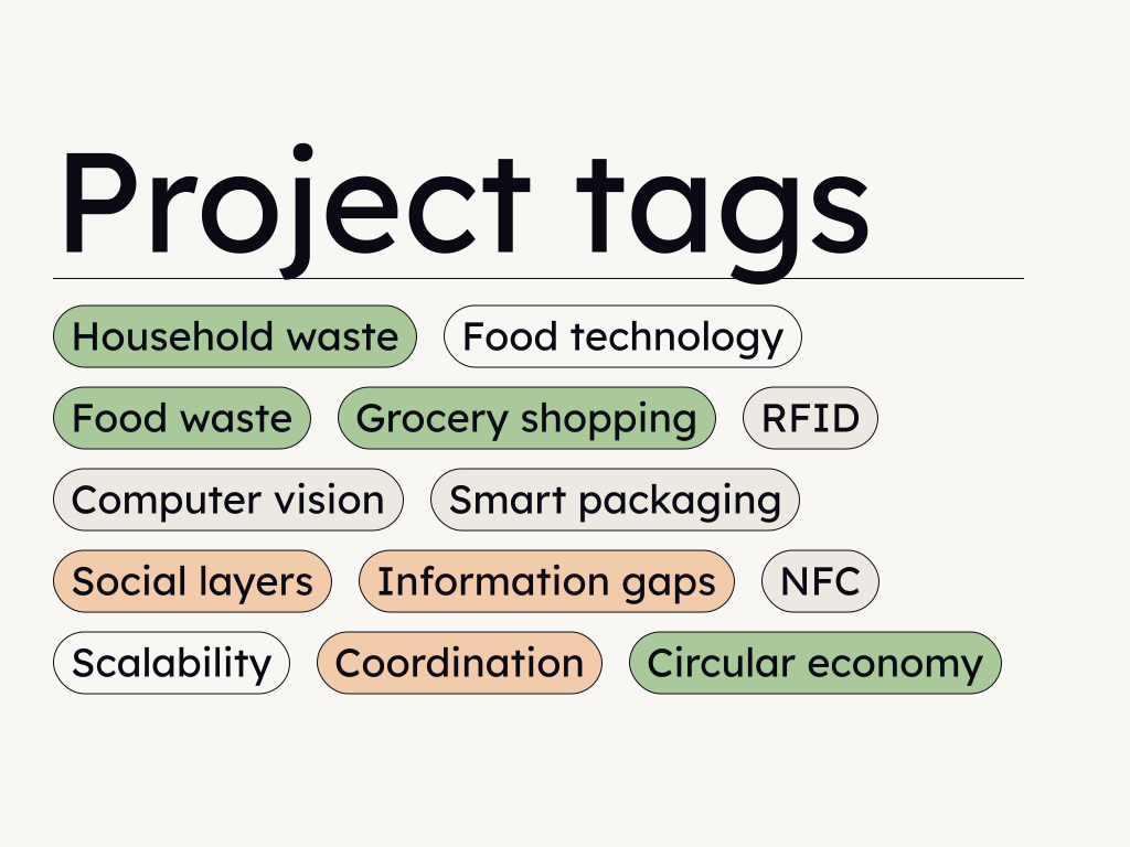
A semantic map to help you have a better idea of the areas of impact of the project
Problem
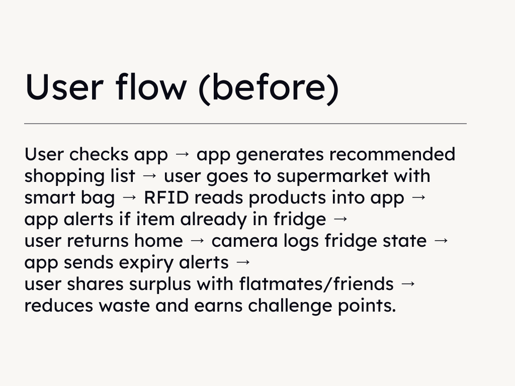
The whole redesign is based off of one premise: while food tracking apps exist, friction is the reason people don't use them. The original group project required users to manually log what they bought, manually update quantities as they cooked, and manually decide what to do with what was left. In practice, it's unlikely anyone will do this consistently. The more steps between opening the fridge and knowing what's inside it, the faster the habit breaks. The original design was asking people to solve a behavior problem (food waste) with more effortful behavior. Working around this contradiction is the challenge for this project.

Research
Before starting the original project, a qualitative survey was conducted with a participant pool made mostly of students to understand attitudes toward food waste. The results showed five groups: 49% “aware and active”, people who already try to reduce waste; 26% “indifferent”, who do not think waste is a real problem; 11% “wasteful”, who are not engaged at all; 10% “unconcerned”, who know about the issue but do not act; and 4% “inconsistent”, who say waste is wrong but still do it.
Based on this, the main target was the aware and active group, as they are already motivated but need better tools. We explored directions such as gamification to reach the inconsistent group by making change feel simple and engaging instead of moral. Sharing and recipes emerged early as the most useful and usable ways to reduce waste. This made it clear that sharing, meaning giving away or exchanging unused food with neighbors, friends, and peers, had to remain optional.
The initial project therefore focused on social features such as sharing, challenges, and gamified recipes as the foundation of a system that reduces waste by connecting people. The idea of supporting passive users and ensuring the system works well at an individual level, as a condition for scaling to social groups, was considered but not fully developed, which weakened the final outcome.
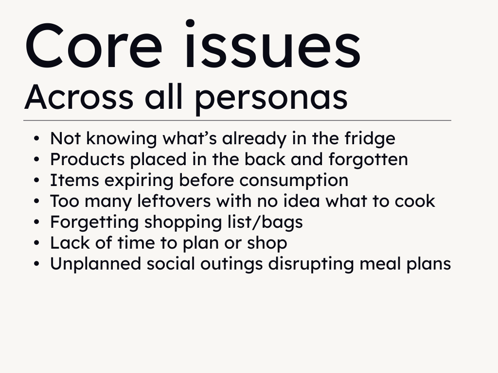
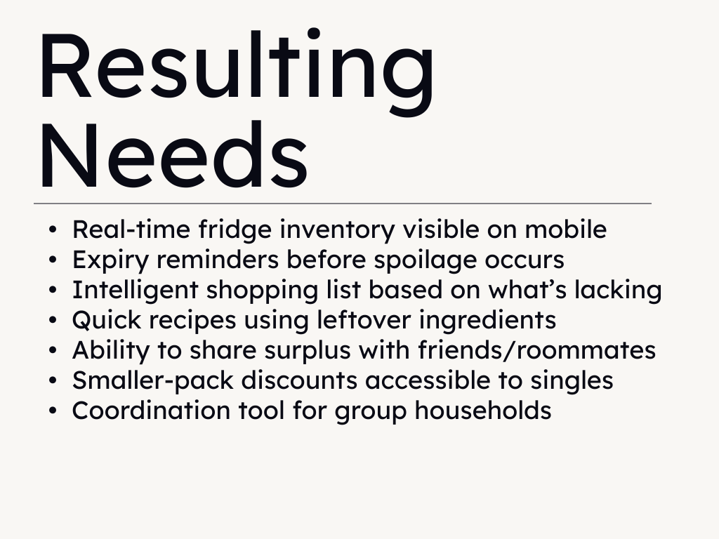
The main insight is that food waste at home is not only a values problem, but also a problem of missing information and coordination. People often do not know what they have, when it expires, or who could use it. Nowa aimed to solve these issues in a simple way that fits into daily habits. The redesign builds on the understanding that willingness to adopt a digital product exists on a spectrum, and aims to make the system easier and more natural to use.
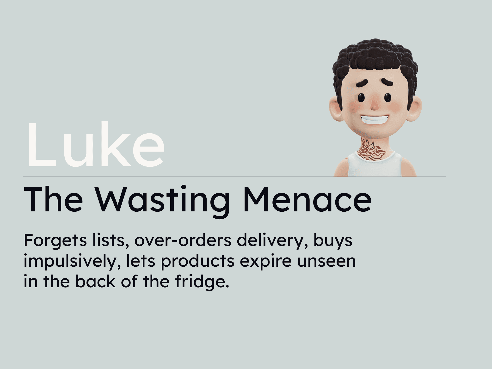
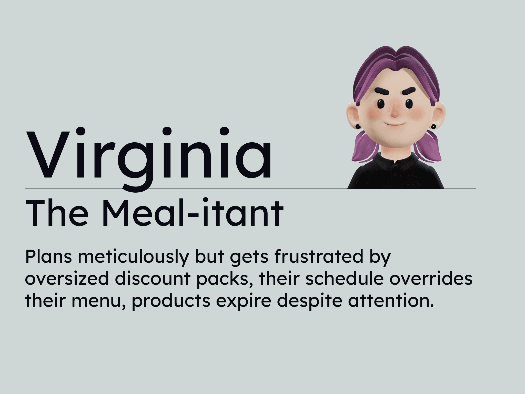
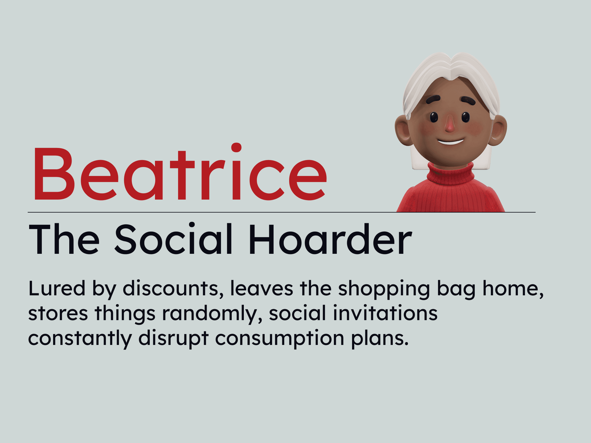
Three user personas were defined: Luke (chaotic, wasteful, instinctive ), Virginia (methodical, diligent, aware), and Beatrice (partially involved, distracted, incoherent), each with basic info like goals, problems, and motivations. For each persona, a customer journey map showed what they do before, during, and after using the app, including their needs, feelings, and pain points. Empathy maps are also created to describe what users feel, think, say, and do. Two scenario posters show a typical day with and without the Nowa feature, with clear steps of how the system is used. Finally, a contextual analysis examined local grocery stores and charities, reviewing their anti-waste solutions to define how Nowa could differentiate by addressing the issue at its root.
Solution
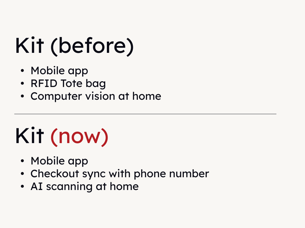
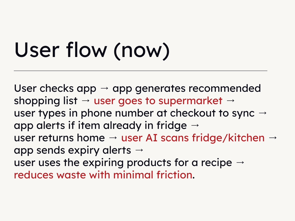
By comparing the original research because against UX research material to find out a way the app could reduce attrition, I realized I had to rethink the user flow around a single reframe: scan-first, manual-last. Instead of asking users to maintain their pantry through input, the system does the heavy lifting for them at a point in their daily routing where the effort is already near zero. At the grocery store, instead of an RFID-equipped tote bag that scans barcodes as items are placed inside it, user automatically sync their apps and receipts are the register by entering their phone number, which is something people have been doing for different purposes such as fidelity programs. This reduces costs and adoption barriers by downsizing the amount of actions required from as-many-products-as-one-buys to one.
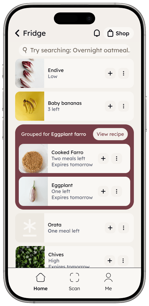
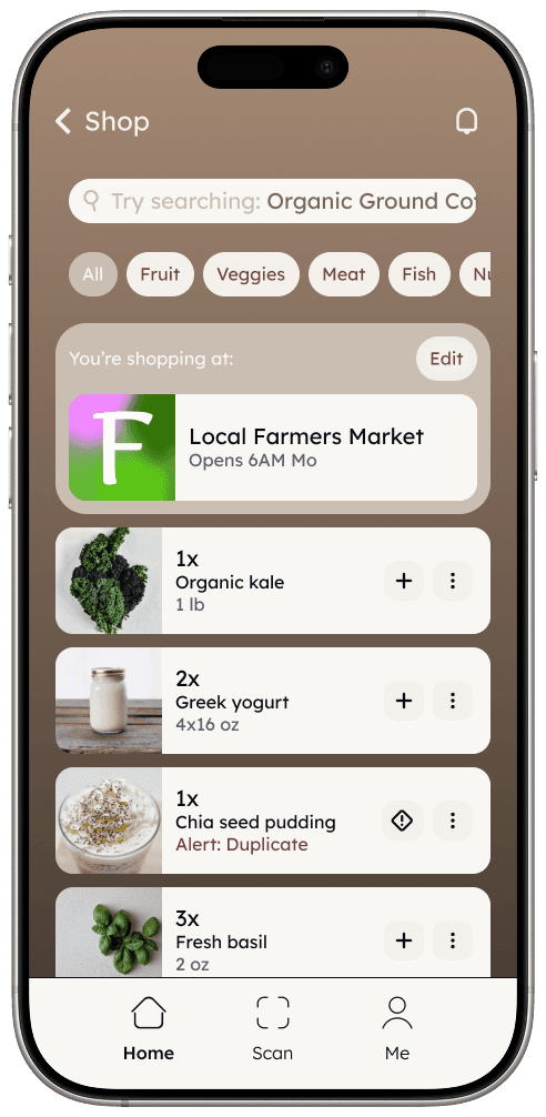
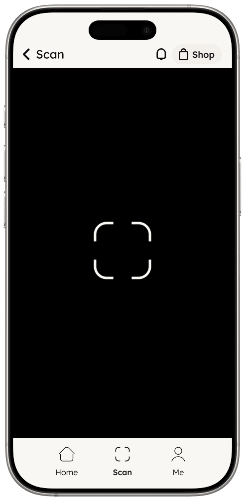
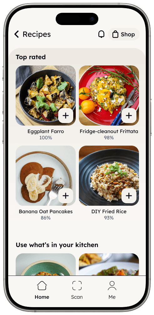
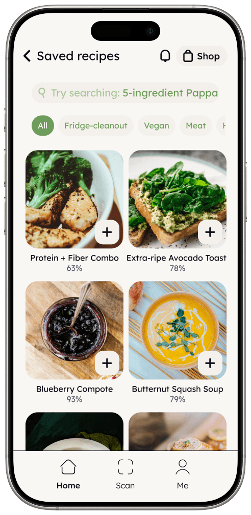
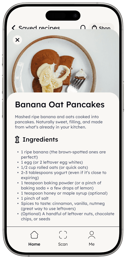
At home, instead of having cameras in the fridge (which would impact costs just as greatly as the RFID tote), the user takes over that task but in a simpler and friction free. By allowing camera sharing and opening the scan section of the app framing the inside of the fridge (or freezer/pantry), AI scanning is triggered and starts to recognize items and adjustsing quantities (asking for user input only when something is genuinely ambiguous, like an open container with an unclear amount left). From there the app suggests recipes based on what's available, groups items for potential preparations, flags items approaching expiry. A grocery list section closes the loop, connecting what's running low to what needs to be bought. I rebuilt the full information architecture around this flow, then redesigned the UI from scratch, and took it to a hi-fi prototype.
Information Architecture of the app

Impact
The redesign reached hi-fi prototype stage, with full UX flows, visual design, and a working prototype. Compared to the original group project, the interaction model is structurally different. The friction that would have driven users away from the habit is removed at the point where it mattered most.
About & Contact